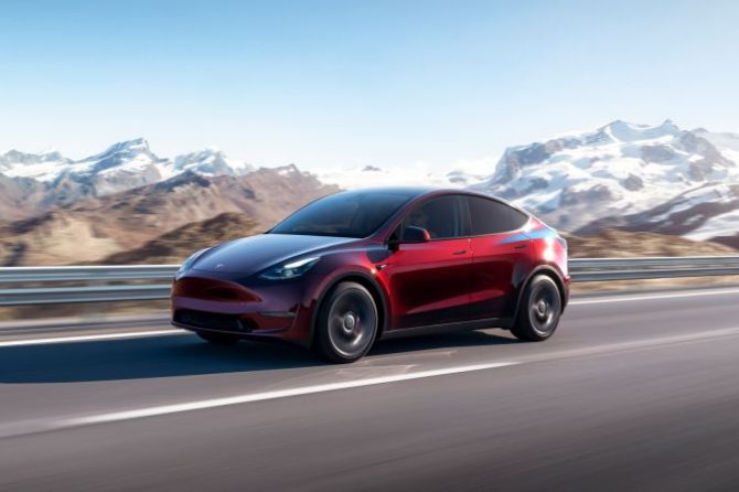
By now you’ve all read the specs on the new Porsche Taycan EV compared to the Tesla Model S, but one of the aspects of the Taycan that isn’t often mentioned is the User Interface (UI), and how it compares with Tesla’s industry leading UI. Tesla’s massive screen and touch-screen controls are the hallmark of any Tesla interior. Now video has emerged of someone going hands-on with the Taycan UI. We’ll let the video speak for itself. It’s almost painful to watch.
When do you think someone will create a better UI than Tesla? After watching this video, it might still be a while.


