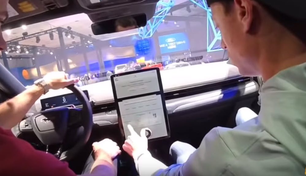
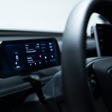
When the Ford Mach-E was announced, the in-car display looked remarkably similar to the Model S and Model X vertical screen, but that’s where the similarities end, as seen in this video of the interface in action.
Taken at the LA Auto Show, a Ford representative walks through the touchscreen features with the folks from HyperChange. The display struggles to keep up as they attempt to navigate the menus and options found on the touchscreen. At one point, they attempt to scroll the screen 7 times, but the screen remains unresponsive. They also try the navigation and maps, only to have the map movement be laggy and frustratingly slow.
From this video it’s clear that Tesla is still head and shoulders above the competition when it comes to the software user experience, as it’s more of a tech company than an automaker. It is important to keep in mind that this is a pre-production unit that could see improvements by the time the car is delivered to the first customers.

