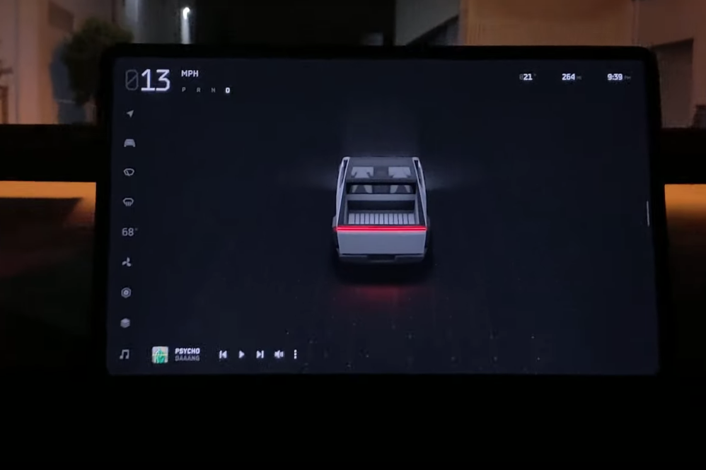
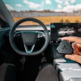
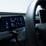
One thing that really stood out from all the photos and videos of the test drives of Tesla’s new Cybertruck was the 17″ centre mounted screen and completely redesigned user interface (UI). Let’s take a closer look at what we saw last night.
The first thing to notice is the driving visualization takes up almost the entire screen. On the Model 3, the driving visualization is relegated to about ⅓ of the screen on the left hand side, with the rest dedicated to the GPS. It appears the Cybertruck UI allows for the visualization to take over the entire screen.
We can also see from the photos that the task bar has been moved from the bottom of the screen to the left side of the screen. There are also some new icons for navigation/directions, wiper control, HVAC controls, and two more that are second and third from the bottom that we can’t quite figure out what they’re for.
The outside temperature, range estimate (and presumably battery estimate too), and clock are now in the upper right hand corner. The speed is in the upper left corner, with the gear options next to it, and not underneath like they are currently on the Model 3.
The navigation animations are also new, with a new oblique view showing your entire route, with 3D buildings. The text directions displayed on the screen are also slightly different, but no big change there. Since the route taken on the test drives was very short, just down the road and back again, we can’t tell what a longer route in the navigation might look like.
You can check out this video that shows the new UI in pretty good detail.

Always get the latest - make Drive Tesla your preferred source on Google
Are you buying a Tesla? If you enjoy our content and we helped in your decision, use our referral link to get three months of Full Self-Driving (FSD).

